Showing posts with label Phoebe Howard. Show all posts

Designer Visions: Phoebe and Jim Howard for House Beautiful

One of my favorite events last year was the Designer Visions: Cinema Style sponsored by Hearst magazines and I couldn't wait to see what they had up their sleeve this year.  They have paired three of their magazines with three top designers to create apartments that were inspired by films all set in New York. They include Phoebe and Jim Howard for House Beautiful - Something's Gotta Give; Steven Gambrel for Town & Country - Six Degrees of Separation; and Richard Hallberg for Veranda - Wall Street.  They have also partnered with Bizzi & Partners, the developers of The Setai Fifth Avenue and all of the fabulous spaces are located on the 58th floor with amazing views.  Each will also be featured in the respective magazines.  House Beautiful has already featured Phoebe Howard's creation in the November issue and you can see Steven Gambrel's in the December issue of Town & Country, while Richard Hallberg will be able to be seen in the January issue of Veranda. 

Note: If you'd like to tour all three spaces, you can do so while supporting a wonderful charity, Baby Buggy, this Thursday, November 11th and Saturday, November 13th.  Tickets and more information are available on Gilt City.

In this post, I am featuring Phoebe and Jim Howard's space that was inspired by Something's Gotta Give.  It's not a complete literal translation of the look in the movie but picks up where the film left off.  It explores what happens after Harry and Erica move in together.  How would they merge their styles and needs in one fabulous space.  In this case, they each have a study but share a dreamy master bedroom.  There are cute little nods to the film such as the framed records that are labeled with Harry's record company name as well as the Chateau Margot wine that Harry bought at the auction where he met Erica's daughter. 
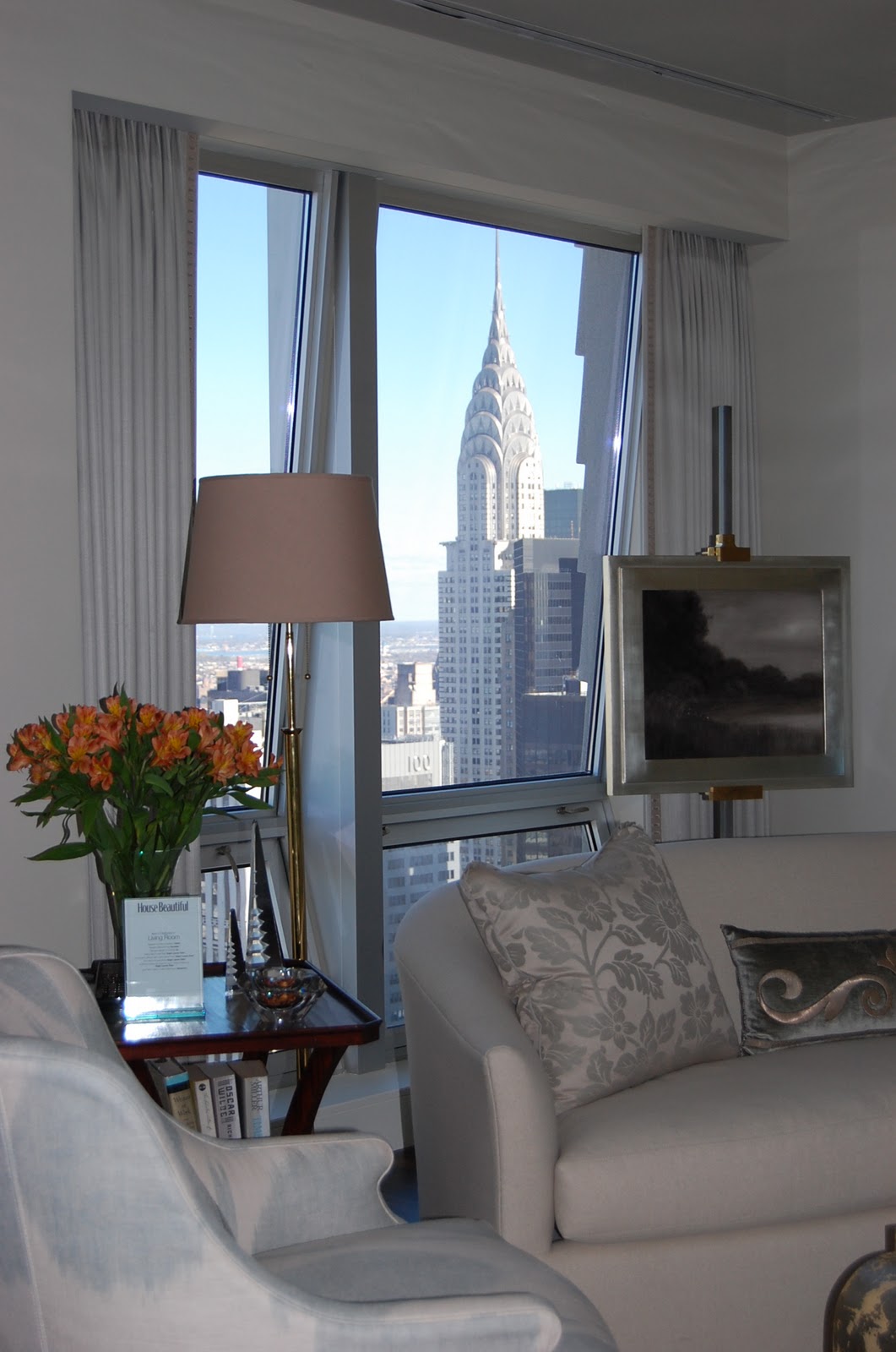
As you know, I'm not a fan of new construction so I always find it so interesting to see how designers tackle a space without architectural details.  In a modern building, what you are really buying is the view and in this case, it is amazing.  I love that you can see the Chrysler Building from many of the rooms in this apartment.

The windows do take up a lot of wall space so all the designers displayed art on easels.

Jim Howard designed the etagere that houses the flat screen and all their books.

I love the open and airy feel of the etegere.  It seems to float in the room and works well with all the lighter colors. 

You can't tell in this photos but the artwork contains bits of diamonds and sparkles in the light.

The dining table shares space in the living room.

Each place setting was set for one of the characters in Something's Gotta Give

I'm also not a fan of open kitchens but this one actually doesn't stand out and works well with the rest of the room.

I didn't get a good photo of it but the HVAC units have been housed in little closets do you don't have to see those awful large units that they usually install in new construction.  In the kitchen, it is to the right of the cafe table.

How would you like drinking your morning coffee in front of that view? It would definitely help wake you up!
The artwork throughout the space also had a dreamy and quiet feeling.

Harry's office/den also has an amazing view.

The desk is by Lucien Rollin.

All the rooms have bits of shine and mirror which add to the glamorous feeling.
Of course Harry's office needs a bar.

The black and white photos are of New York and Paris, the two cities with special meaning to Harry and Erica.

I love this vignette that was tucked around the corner.  It would the perfect place to store all of Harry's papers.

Erica's retreat is dreamy and quiet.  The day bed also serves as a place for overnight guests including her grandchildren.

Jim Howard designed the bed.  The wall and drapery fabric is Mark Alexander by Romo's Jahangir.

I love all the artwork in this room that looks collected.  The colored mats also pop off of the neutal walls.


A bone box from John Rosselli sits on an 18th-century Portuguese cabinet from Lee Calicchio. 

Framed records from Harry's label.

The dreamy master bedroom.

You can see how the room changes as the light outside changes.

The fabric covered walls help to warm up the walls in a modern apartment and create a cozy bedroom.
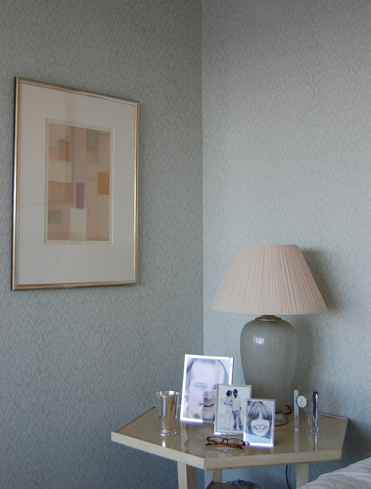
The framed photos of Erica and Harry were a sweet touch.

You can see here that although the lamps are the same, there are different nightstands.  You don't have to always match everything in a room. 

The Hickory Chair nightstand holds Erica's Tony Award for her play about Harry and also her glasses.

I like how they tucked the television in the corner so you don't even see it when you enter the room.

Hope they install some privacy shades in the bathroom!

It would be fun to relax in the Kohler tub while you gazed at the view!

I would definitely like a little more privacy but that's just me!

But the view is to die for! 

Photos by Heather Clawson for Habitually Chic and from Hearst magazines

Going Green


In honor of St. Patrick's Day, I thought I'd be pretty uncreative and pull together some of my favorite green rooms. I'm always a fan of bright, monochromatic (or dichromatic) spaces and green is one of my favorite colors when you're trying to go bright and bold, but still have a "liveable" room. Unlike, say, orange or yellow, Green -- and even bold greens like kelly green -- read as a neutral when they stand alone or when only paired with true neutrals like white or black.

 
I've been coveting these Ava dining chairs from Annie Selke for months. I also love how Amanda carried the green onto the heavy beams, creating a real architectural feature out of what could otherwise best be described as bulkheads. I also love the soft brass fixtures with the green, the warmth lends a richness and depth to the room that I don't think nickel or silver could.


With its cheerful color palette and midcentury touches, this room is classic Jonathan Adler.


This room feels classic New England to me, with the roaring fire, heavy moldings and quilt on the bed. The color, however, really pulls it into the 21st century. I don't know if you'd call this color a blue-green or a green-blue, but I love it.


I typically try to avoid competing shades of a single color in a room, but the lime green walls and turquoise chairs really works together here. The overall effect is updated Palm Beach, without the hyper-coordination that can often make a room feel stuffy.


Ah, another set of dining chairs that I'd love to own for myself -- anyone know the source on these? All the major elements in this room are neutral, but the room feels very colorful thanks to the green curtains, seat cushions and plates. In a few years the owner could easily switch these elements out with a different color for an entirely different look. It just goes to show you that you don't need a lot of color to make a big impact.


The mix of modern and traditional elements in this room is wonderful, but the best feature by far is all that gorgeous natural light streaming in from the floor-to-ceiling window.


I think I'm increasingly obsessed with grass cloth -- if only I could find a place to use it in my own house! In any case, I love the mix of patterns in this room. The graphic rug, the cheetah print chairs and the grasscloth on the walls all lend different but subtle patterns, the combination of which is really greater than the sum of its parts.
Using a great print as a jumping off point for a room is a sure-fire way to achieve a cohesive design. The lavender and lime color palette is pulled from the fabric used on the ottoman and side chair in the foreground. The fabric is then repeated in the pillows on the sofa, ensuring a balance between both sides of the room (after all, it would feel a bit "off" if all the print were on one side of the coffee table and all the solid fabrics were on the other).
These forest green leather doors with brass nailhead trim make me realize that my hollow-core doors are such a missed design opportunity. I also like how the hallway stands on its own design-wise, yet still works with the adjoining entry as it picks up on the greens in the wallcovering and generally harmonizes with the browns that dominate the adjoining space.
I love the tight brown and lime color palette in this room -- it really enabled John to mix prints with abandon: plaid, Ikat, butterflies, geometrics...and yet it all harmonizes beautifully because all the prints contain the same colors (and when they don't, like in the plaid and Ikat prints, Willey added the missing color in as trim). I normally shy away from floral or butterfly prints as too girly, but the color palette and the great mix of other prints makes this room feel gender neutral to me. Also, did you notice the trim on the ceiling? What a great (and inexpensive) way to bring some interest to your fifth wall!
Pink and green is such a classic, preppy color combination, but it's one that never fails to make me happy. It's even better when the colors are turned up a notch as with the hot pink drapes here. The softer neutrals in the rug and chairs help the room from feeling too much like the inside of a Lily Pulitzer store. I will say though that the composition feels a bit unbalanced to me, as all the saturated color in the green sofa and yellow pillows isn't set off by anything. I'd perhaps have included brighter pillows on the neutral side chairs and the white flokati pillows on the sofa...but that's just me.
More fabulous pink and green, but this time both the pink and the green are in bold, saturated shades. I particularly love the contrast of the modern pop art with the very traditional handpainted wallpaper. Such a great contrast really makes this room stand out for me.
As much as I love a serene bathroom, I can't deny that this bright green bathroom from Sixx Designs is tons of fun. The salvaged pharmacy sign is a great touch and picks up on the retro black and white tiling. I really love the strong blue of the pendant light fixture. It's an unexpected, but brilliant touch in this room.
Tobi is definitely a designer after my own heart. She's fundamentally traditional, but she's fond of bold color schemes, patterns and tightly edited spaces, all of which is perfectly exhibited in this green, white and gold living room. It's unusual to see two side tables that are actually taller than the sofa arms, but I like the built-in, cozy look that it lends the room....Oh and I would give my right arm for that coffee table. My only complaint? That Tobi karate-chopped the throw pillows. I hate that! Why do people do that?! Fluff, don't chop, I beg you.

I love the sophisticated, yet tropical feel of this bedroom. Again, I love the grasscloth wallpaper and its chartreuse hue is a very modern touch against the cottage-style bed as almost any other color green could have read as too country here.
Green is, ultimately, a natural color choice in interior design. It pairs well with both complimentary colors (like pink) and analogous colors (like yellow or blue) and is a great accent color for predominately neutral palettes. Green can read as energetic or calming, intense or calm, glamorous or laid back. Green also works in a variety of design styles, from traditional to modern. But whichever direction you choose to take green in your design, you can be assured that you'll be bringing in a little bit of Irish luck into your home.